

How Packaging Design Affects Perception
Have you ever picked up a product just because its packaging caught your eye? Or maybe you've chosen one brand over another because it somehow felt "better" or "more trustworthy"? I know I have! In fact since becoming a designer, good packaging is even more noticeable to me and has influenced me many times!
As someone who's spent the last four years immersed in the world of packaging design, I've developed a deep appreciation for this often overlooked art form. There's something magical about creating that first touchpoint between a product and its potential owner, and I'm excited to share what I've learned on this journey!
The Silent Salesperson in Your Shopping Cart
Think of packaging as a product's introduction—it's the first impression that can make or break a relationship. Packaging doesn't just protect what's inside; it tells a story, creates an emotional connection, and sometimes even justifies why we should pay more for one product over another. I saw this firsthand when designing boxes for a cookie brand—their delicious treats deserved packaging that communicated the care and quality baked into each bite. The right packaging transformed them from just another cookie into a high-end and gift-worthy experience!
The Psychology of Color: Beyond "Pretty"
Colors aren't just decorative choices—they're psychological tools that speak directly to our emotions and cultural associations. This revelation changed how I approach every project, making color selection a strategic decision rather than just an aesthetic one.
Here's how different colors typically affect perception:
Red – Creates urgency and excitement. When designing business cards and labels for a homemade salsa brand, I used warm reds to hint at the spiciness within and create that mouth-watering anticipation!
Blue – Evokes trust and reliability. There's a reason so many banks and healthcare products use blue in their branding.
Green – Signals healthiness and sustainability. For organic or natural products, greens can instantly communicate eco-friendliness.
Black – Communicates luxury and sophistication. I saw this applied when creating high-end olive oil gift packaging—the deep black boxes with subtle gold accents elevated the perceived value of each piece.
Yellow – Captures attention and suggests optimism. It's why you'll often find it on packages designed to stand out on crowded shelves.
Typography: The Voice of Your Product
The fonts and text styling on packaging act as the "voice" of your product. Think about it—would you trust a medicine that used Comic Sans on its packaging? Probably not! Each typeface carries its own personality and connotations.
Typography choices influence perception in several ways:
Serif fonts often suggest tradition, reliability, and authority
Sans-serif fonts typically communicate modernity, cleanliness, and straightforwardness
Script fonts can evoke handcrafted quality, personalization, and elegance
Bold typography suggests confidence and strength
Delicate typography communicates precision and refinement
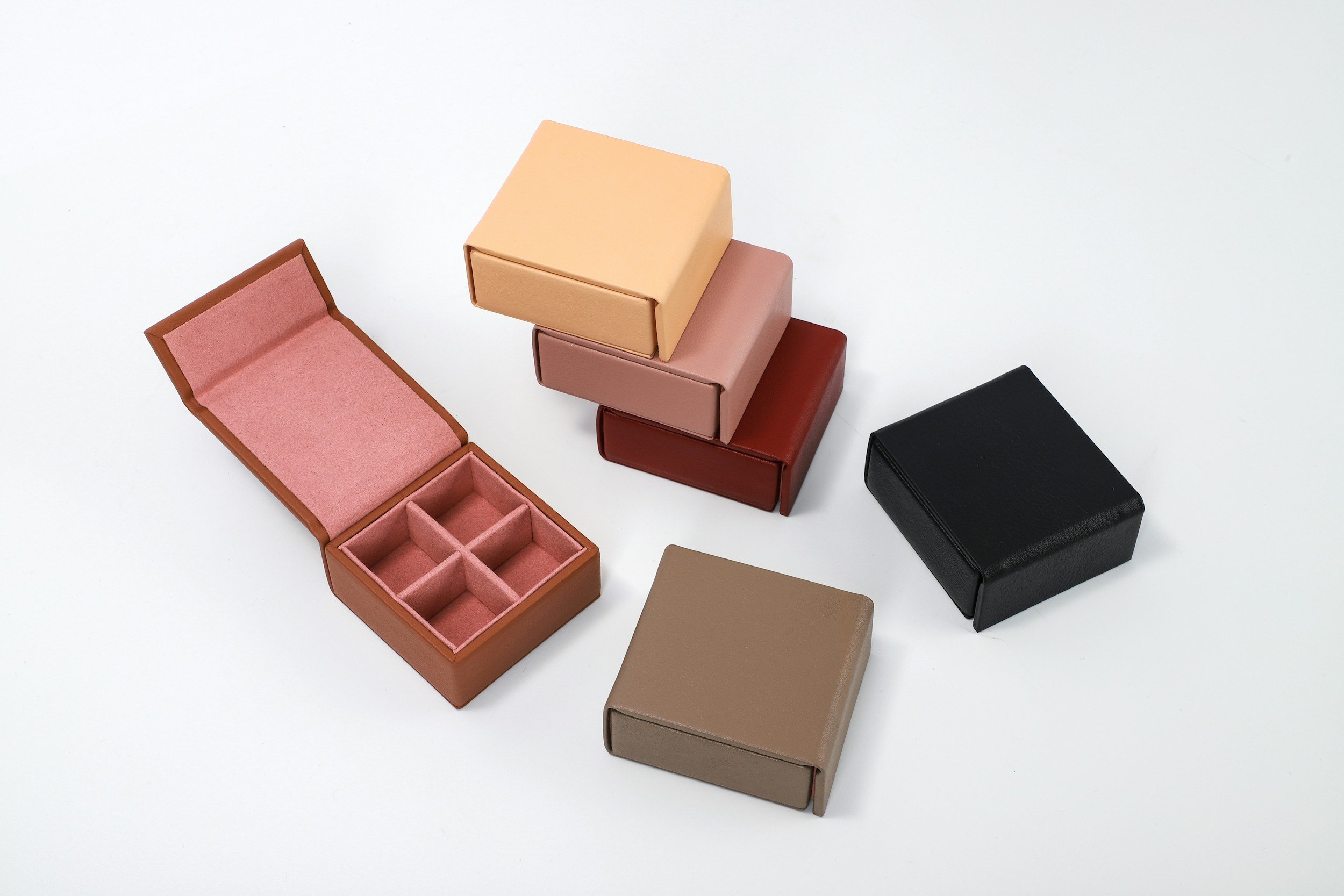
Shapes and Structures: The Feel in Your Hands
The physical form of packaging speaks volumes before a single word is read. I've always been fascinated by how the simple act of holding a package creates an immediate emotional response.
Here's what different packaging structures tend to communicate:
Angular, geometric shapes – Masculinity, efficiency, and technical excellence
Curved, rounded forms – Femininity, accessibility, and comfort
Unusual or asymmetrical designs – Creativity, uniqueness, and premium positioning
Miniaturization – Preciousness, concentrated quality, and giftability
Oversized packaging – Abundance, value, and generosity
Visual Hierarchy: Guiding the Eye
How elements are arranged on packaging determines what consumers notice first, second, and third. This visual journey isn't accidental—it's carefully orchestrated to create maximum impact. One truth I've encountered repeatedly is that packages typically have just a few seconds to make an impression. That's why thoughtful visual hierarchy isn't just about making things pretty—it's about survival on the shelf!
Effective visual hierarchy typically:
Grabs attention with a focal point (often the brand name or a key benefit)
Creates a clear path for the eye to follow
Emphasizes important information through size, color, and positioning
Uses negative space strategically to prevent visual overwhelm
Groups related information logically
Cultural and Contextual Considerations
Packaging doesn't exist in a vacuum—it lives within cultural contexts that significantly impact how everything is perceived by consumers and clients alike. I distinctly remember diving deep into researching influential design trends and the various color associations that vary across different regions, ultimately leading to the creation of packaging that reflects thoughtful adaptability to those unique cultural nuances. That invaluable experience taught me that effective packaging design necessitates a strong cultural awareness and the ability to adapt to diverse expectations. Even within one country, subtle regional differences can truly matter and make a meaningful difference in the reception of a product!
The Ethics of Perception Management
With the power to influence perception comes genuine responsibility. Even as a relatively new designer, I've made it a personal commitment to use design to enhance authentic product attributes rather than to mislead. When working with a chocolate company, I was proud that our luxurious packaging accurately reflected the exceptional quality of their hand-crafted confections. The packaging promised a premium experience, and the product delivered. That alignment between promise and reality is what builds lasting customer relationships. Having packaging that is confusing or misleading can turn people away from your product and business so having clear and honest packaging makes a difference.
The Future of Packaging Perception
As we become more environmentally conscious and digitally connected, packaging perception is evolving rapidly. Smart packaging with QR codes, augmented reality experiences, and sustainable materials are changing how we interact with products. This evolution excites me! For many companies I have worked with QR codes have been a new feature they have welcomed—extending the product experience beyond the physical item. Whether it was simply linked to their website or a digital business card they found ways to make it work for their businesses. The growing emphasis on sustainability also presents design challenges. How do we create packaging that's environmentally responsible while still capturing attention and communicating quality? This question drives much of my current exploration and learning.
Finding Your Packaging Story
Whether you're a business owner considering your packaging strategy or simply a curious consumer, I encourage you to look more closely at the packaging around you. What stories is it telling? What emotions does it evoke? How does it guide your perceptions and choices? My four-year journey in design has taught me that the most effective packaging isn't about manipulation—it's about honest communication. When packaging authentically represents what's inside while speaking clearly to consumer needs and values, it creates connections that go beyond the transaction.
The next time you find yourself drawn to a product on a shelf, take a moment to ask yourself why. The answer might reveal as much about yourself as it does about the clever design that caught your eye!
What packaging designs have influenced your perceptions? I'd love to hear your own experiences in the comments below!
This article draws from my four years designing packaging for various clients, from food makers to comfort product companies. I've discovered that packaging isn't just about protecting a product—it's about communicating its soul. If you'd like to explore how intentional design could help tell your product's story, I'd be honored to connect!